Hello! If you are reading this, there is a chance you are freaking out about designing a poster for an upcoming scientific conference. Maybe not freaking out, but at least feeling a sense of unease? You’re a scientist, not an artist. Right?
I’m here to help! Even though I am a registered nurse working on my PhD in nursing, I have a background in art. I earned my Bachelor of Arts in Studio Art in 2004, with a focus on photography and digital media. Post-graduation, I worked as a professional photographer for a website for three years before shifting away from the visual arts as my career choice. I am by no means an expert in graphic design, but I can provide you with some resources to improve your visual communication skills.
First, let me reassure you that visual communication—using symbols and imagery to convey meaning—can be learned. Making an effective poster does not require a special inborn artistic talent. Let me repeat that: you do not need “natural talent” to create an effective poster. Period.
I’m going to let you in on a secret….Visual communicators like artists and graphic designers often rely on visual hierarchy “rules” so deeply ingrained in us that most people are unaware they exist. You can find various versions of the image below floating around social media:
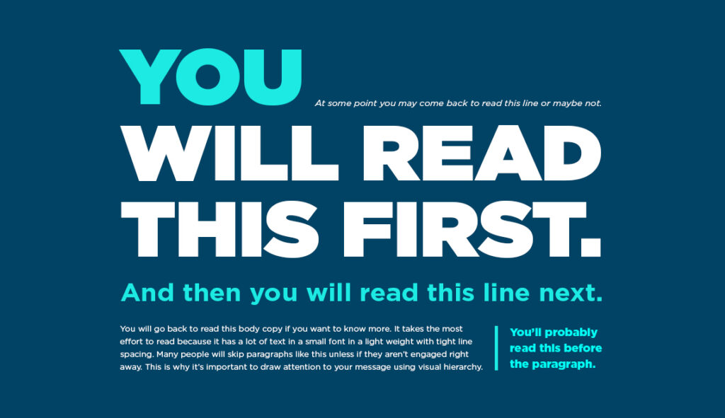
Most people read that image in the exact order indicated by the text within it. Using size, placement, and color, the designer employs unspoken design rules so ubiquitous that we follow them without thinking about it. An adept designer guides the user’s experience with their content in a subtle but highly effective way. Advertisers take advantage of our subconscious awareness of these design rules to keep our eyeballs on their content longer (usually to convince you to buy something). You can borrow some of these techniques to keep viewers engaged with your poster’s content.
First: When working primarily with text, layout and composition are important. Watch this short video to get a better idea of how these concepts might affect your poster design.
Next: Watch this video. The whole thing. Please. I know 20 minutes might seem long, but I promise you will find the information valuable. In fact, I can guarantee this overview of how the currently accepted scientific poster design is more harmful than helpful will change the way you approach your poster’s design.
Finally: UNMC offers poster templates to take some of the guesswork out of design for beginners and provide branding that identifies the school you are proudly representing. Click on that link to UNMC’s branding page and scroll down to the bottom for poster templates. Two of them (the “modern templates”) use Mike Morrison’s #betterposter design discussed in the video. Don’t forget to adjust the size in PowerPoint to fit your conference’s requirements if needed.
Advice you (maybe) didn’t know you needed:
1. The last thing you want to hear from someone at the poster session is, “Tell me about your poster.” It means your poster is too overloaded with information to inspire even a simple question. Your goal is to elicit questions or comments specific to your poster’s content.
2. Whether you opt for a modern or traditional layout, be prepared to EDIT. YOUR. WORDS. Your poster is an advertisement for your work, not source material. Add a QR code to link interested readers to your full paper online. Or do some networking and offer to send it via email. Do not attempt to unload the entire contents of your paper or project in this one small space!
3. Check the conference’s website to find the maximum allowed size for your poster, then check with the printer to make sure they can print those dimensions. Do not skip this step! Confirming allowable size with the printer can save you a lot of heartache. The conference might allow a 45×45″ poster, but your printer’s maximum printing width might be 41″. In that case, your poster should be 41×45″ to avoid losing some of your design during the printing process.
4. Size is about the only rule most conferences impose on their poster presentations. If they have other design guidelines follow those too. Step out of your comfort zone, aim to create something that catches the eye and starts a conversation. That’s the whole point, right? We want to get people talking about our research. Give them a reason to stop and engage!
Helpful tips and websites:
-Use royalty-free images to add interest to your poster. Vecteezy and Pexels both have a great selection. Downloading royalty-free or open source images will avoid copyright infringement. Also, if an image looks blurry or pixelated on your screen, it will look that way when you print it. Trash it and find a higher-resolution alternative.
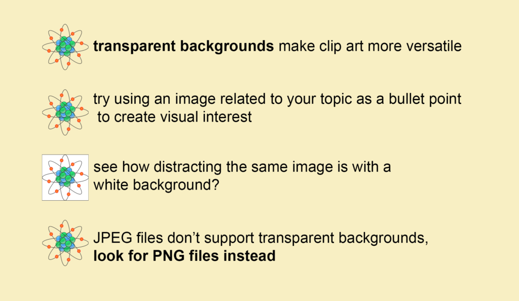
-Use clip art to add a punch to your poster. Look for .png files for images without that pesky white background. This simple trick can elevate your design. Add “png” or “transparent background” to your google image search to find them.
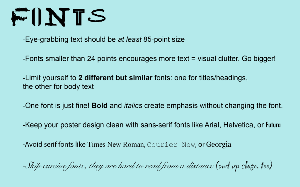
-General rules for fonts (technically called “typeface”):
One last tidbit: Show your poster to a non-sciency person. Do they glance at it, say, “Great job buddy, keep up the good work!” and walk away? Or do they stop and exclaim, “You have evidence that we’re actually living in a computer simulation?” or “Does your new magic weight loss pill have side effects?” If they show interest in the poster’s content, you are on to something with your design. If not, you need to consider the possibility that your poster is not the attention-grabbing masterpiece that you think it is.
Good luck and feel free to reach out to me via email at kirsten.hepburn@unmc.edu for constructive advice during your poster creation process. I love helping people maximize their visual communication abilities in a judgement-free zone.