Hours after a symbolic groundbreaking Tuesday, campus leaders unveiled the brand identity for the Fred & Pamela Buffett Cancer Center Tuesday night.
“Much in the same way cancer researchers look for patterns to identify causes and possible cures, the patterns that emerged from many meetings helped to inspire the dynamic new identity,” said UNMC Chancellor Harold M. Maurer, M.D. “It is destined to be the widely-recognized symbol of the dedication, compassion and innovation of our new Cancer Center.”
The Fred & Pamela Buffett Cancer Center branding video
“The cancer center’s brand will have national and international exposure – which inspired marketing and public relations staff at the hospital and UNMC to work closely together,” said Tadd Pullin, senior vice president of marketing and strategy development at The Nebraska Medical Center.
“The final result is a vibrant logo that reflects the diversity and union of people who will be attracted to the center from around the world – faculty, students, researchers, patients and families. The unexpected use of new colors, beyond the red palette used in The Nebraska Medical Center and UNMC logos, conveys hope, energy, life and diversity – and will create opportunities to infuse color into the new cancer center buildings.
“Another great strength of this brand is that it anticipates placement in mobile internet applications and social media, and can easily adapt to new emerging communication platforms,” he said.
“The successful collaboration among teams has been rewarding and is a testament to the strength of our two organizations,” said Bill O’Neill, UNMC director of public relations.
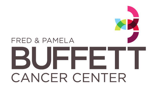
The distinctive new mark features a pair of three-quarter circles that, when viewed separately, form the two letter Cs in the Cancer Center’s name. When viewed together, the right sides tinted in red form a “B” for Buffett. Each C has three solid sections depicting patient care, research and education, and the “B” that is formed also can be seen as a “3”, depicting those three areas. The Cs are open to indicate the welcome discovery that will take place, and they are linked together to symbolize the woven-together collaboration of patient care, research and education.
Each color also has meaning. The lighter shade of red comes from UNMC’s traditional colors, while the darker red represents The Nebraska Medical Center. The two other colors were selected to signify the energy, personalization and international diversity of the Cancer Center’s work.
Purposely situated above and to the far right of the center’s name, like twin gears in motion, the symbol illustrates the Fred & Pamela Buffett Cancer Center’s synchronized, continuous commitment to lead the way into the future of cancer care.